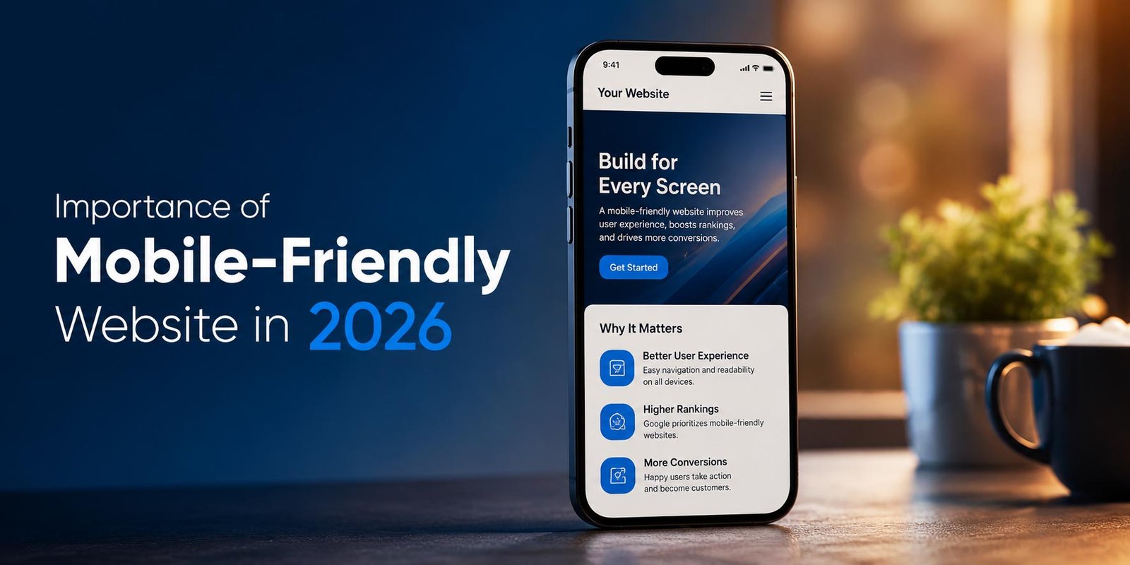
Welcome to the era where smartphones entirely dictate market dominance. As we navigate the digital landscape in 2026, having a mobile-friendly website is no longer just a “nice-to-have” design feature; it is the absolute foundation of your business’s online existence. With the rapid evolution of Generative AI, AI Overviews (AIO), and advanced search engine algorithms, mobile optimization directly determines whether your business thrives or becomes completely invisible to potential customers.
Today’s consumers demand lightning-fast, intuitive, and seamless browsing experiences on their mobile devices. If your website fails to deliver on these expectations, your competitors are only a tap away. This comprehensive guide explores why a mobile-responsive website is critical in 2026, how it impacts next-generation search engines, and what you must do to secure your competitive edge.
1. Why a Mobile-Friendly Website is Non-Negotiable in 2026
The shift toward mobile browsing has reached an absolute peak. In 2026, desktop traffic is a minority for most consumer-facing industries. But the urgency of mobile optimization goes far beyond standard traffic metrics—it is deeply tied to how modern search engines and AI models process information.
Mobile-First Indexing is the Only Indexing
Google and other major search engines have completely finalized their transition to mobile-first indexing. This means search engines predominantly use the mobile version of your website’s content for indexing and ranking. If your mobile site has less content, poor navigation, or slower load times than your desktop site, your overall search rankings will suffer massively. A responsive web design ensures parity across all devices, sending strong, unified signals to search engine crawlers.
The Rise of GEO (Generative Engine Optimization)
We are in the age of ChatGPT, Gemini, Perplexity, and Claude. These AI-driven search engines prioritize fetching answers from websites that are highly accessible, structured, and fast. Generative Engine Optimization (GEO) relies on authoritative content that can be easily parsed. If an AI bot encounters a non-responsive, clunky mobile site, it will abandon the crawl, meaning your brand will be entirely left out of AI Overviews and generative chat responses.
2. The Intersection of Mobile Optimization, SEO, and AEO
Understanding the symbiotic relationship between mobile design and modern search optimization is essential. SEO (Search Engine Optimization) and AEO (Answer Engine Optimization) demand a flawless mobile foundation.
Mastering Answer Engine Optimization (AEO)
Answer Engine Optimization focuses on structuring your content to appear in Featured Snippets, People Also Ask (PAA) boxes, and AI summaries. Because the vast majority of voice searches and quick-answer queries happen on mobile devices, search engines heavily favor mobile-optimized sites for these zero-click results. To dominate AEO, your mobile site must feature clean headers, concise paragraph structures, and fast-loading media.
Synergy with Off-Page SEO Strategies
A beautiful mobile site amplifies all other marketing efforts. When you build high-quality backlinks and drive referral traffic, those users will likely arrive via mobile. If they land on a broken, unoptimized page, they will bounce immediately, signaling to search engines that your site is not valuable. A strong mobile experience ensures your off-page efforts convert. To understand how to build external authority effectively, check out our comprehensive Off-Page SEO Complete Guide.
3. How Mobile Responsiveness Drives UX and Skyrockets Conversions
At the heart of every successful digital strategy is User Experience (UX). In 2026, patience is thinner than ever. A delay of just two seconds on a mobile page can increase bounce rates by over 50%. A mobile-optimized website is designed specifically for touch interactions, smaller screens, and on-the-go browsing.
The Danger of Poor UX
When users encounter tiny text, unclickable buttons, or horizontal scrolling on their smartphones, frustration sets in instantly. This friction kills conversion rates. Whether your goal is lead generation, e-commerce sales, or simple brand awareness, every interaction must be frictionless. This is precisely why relying on cheap, drag-and-drop website builders often leads to disaster. For a deeper understanding of this pitfall, read our detailed analysis on Why DIY Websites Fail.
Conversion-Focused Mobile Design Elements
To turn mobile traffic into paying customers, your site needs conversion-focused CTAs (Call to Actions) that are thumb-friendly and strategically placed. Sticky headers, one-tap phone calls, and simplified mobile checkout processes are proven strategies that dramatically increase ROI. A mobile-friendly website builds trust—a core pillar of the E-E-A-T (Experience, Expertise, Authoritativeness, Trustworthiness) framework.
4. Essential Features of a High-Performing Mobile Website in 2026
What exactly makes a website mobile-friendly in the current landscape? Here are the critical technical elements that define a high-performance mobile site:
- Core Web Vitals Perfection: Search engines demand phenomenal scores in Largest Contentful Paint (LCP), Interaction to Next Paint (INP), and Cumulative Layout Shift (CLS). Your mobile site must load instantly and remain visually stable.
- Responsive Architecture: The website must fluidly adapt to any screen size—from a giant tablet to the slimmest smartphone—without losing functionality.
- Optimized Touch Targets: Buttons, links, and navigation menus must be adequately spaced to prevent accidental clicks and improve the user journey.
- Accessible Typography: Fonts must scale dynamically, ensuring readability without the user having to pinch and zoom.
- Dark Mode Compatibility: With the majority of mobile users preferring dark mode in 2026, having a site that seamlessly adapts to user OS preferences is a major UX advantage.
5. Why Tech XML is the Right Choice for Your Digital Growth
Understanding the importance of a mobile-friendly website is only the first step; executing it flawlessly requires a dedicated partner. This is where Tech XML stands apart from the crowd.
At Tech XML, we do not just build websites; we engineer comprehensive digital ecosystems designed to dominate 2026’s complex search algorithms. Our approach integrates cutting-edge responsive web design with advanced SEO, GEO, and AEO strategies from day one. We adhere strictly to Google’s E-E-A-T guidelines, ensuring your site not only looks stunning on every mobile device but also establishes unparalleled industry authority.
By choosing Tech XML, you are partnering with a team of full-stack experts who understand how to merge aesthetic brilliance with aggressive conversion rate optimization. We eliminate the technical debt and poor performance associated with DIY platforms, delivering custom-coded, lightning-fast mobile experiences that transform casual visitors into loyal customers.
6. Frequently Asked Questions (FAQ)
What is Generative Engine Optimization (GEO) in mobile web design?
GEO is the practice of optimizing your website so that AI search engines (like ChatGPT, Gemini, and Claude) can easily understand and reference your content. A fast, structured, and mobile-friendly website is crucial for GEO, as AI models prioritize highly accessible and authoritative mobile data sources.
Will my desktop rankings drop if my mobile site is slow?
Yes. Because search engines use mobile-first indexing, the performance, speed, and content of your mobile site directly dictate your overall rankings across all devices, including desktop.
How does a mobile-friendly website improve E-E-A-T?
Trustworthiness and Experience are key components of E-E-A-T. A secure, fast, and easy-to-navigate mobile site provides a superior user experience, signaling to both users and search engines that your brand is professional, credible, and trustworthy.
Why are DIY website builders bad for mobile SEO?
DIY website builders often rely on bloated code and rigid templates that adapt poorly to modern mobile screens. They frequently fail Core Web Vitals tests, resulting in slow load times and poor user experiences, which ultimately harms your search engine rankings.
Ready to Dominate Your Market?
Stop wasting budget on fragmented tactics. Partner with Tech XML to build a cohesive growth machine.





Leave a Reply